
The Three-Panel Film Strip Is the First AI Format With a House Style
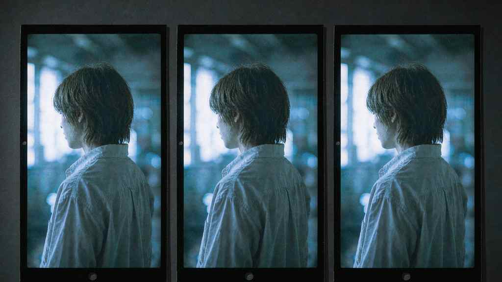
If you spend an evening on Douyin or Xiaohongshu, you will see the same image layout over and over: three vertical frames side by side, a person in each of them, cool-toned, slightly overexposed, film grain, and a line of bilingual text burned into the bottom of the frame.
Chinese creators call it 电影感三宫格 — the cinematic three-panel. The prompt that makes it is usually passed around as a block of text, and the block is remarkably specific. Upload one photo. Ask for three frames from the same scene. Frame one: a close-up from behind, upper body, wind in the hair, subtitle reading 山的后面是什么? / What's beyond the mountain? Frame two: a medium shot, side-on, holding flowers, looking down, subtitle reading 你不用告诉我 / You don't have to tell me. Frame three: wide, the figure small against the sky. Cool palette, Fuji film stock, blown highlights, coarse grain, shadows still detailed, soft diffused light, no hard edges, subtitles bottom-center, composite the three into one image at 2:3.
It looks like a photo shoot. It is a template, and the template is the interesting object.
Why three, and why vertical
Three frames is the smallest number that can tell a story without being a sequence. Two feels like a before-and-after. Four feels like a grid, and a grid reads as a contact sheet — evidence, not emotion. Three reads as a film strip: an establishing moment, a turn, a release.
Vertical is a platform constraint that turned into an aesthetic. A 9:16 frame is what the phone gives you, so three of them side by side in a 2:3 canvas produce a wide image made of tall windows. It is the shape of a cinema screen cut into three phone screens, which is precisely the visual joke that makes it work: film grammar, delivered in the format the feed already rewards.
And then there is the practical part nobody says out loud. A three-panel image is a swipeable object. It can be posted as one image that reads at thumbnail size, or cropped into three posts, or used as a cover plus two detail shots. One generation, several placements.
The text is doing the emotional work
The burned-in bilingual subtitle is the part most imitators get wrong. They copy the composition and skip the typography, and the result looks like a stock photo with a caption slapped on.
What makes the format work is that the words are short, slightly melancholy, and translated. Chinese on top, English below, same weight, bottom-center. The translation is not there for an international audience. It is there because two lines of text in two languages read as a film still, while one line reads as a meme. The second language is a texture, not a message.
That is also why the format resists translation into other markets. Swap the languages and it becomes a subtitle exercise. Keep the pairing and it looks like a Chinese post, because it is one. The aesthetic is not universal; it is a specific solution to a specific feed.
Consistency is the actual technical problem
Look at what the prompt is really asking for. The same face in three frames, at three focal lengths. The same shirt. The same light direction, despite the camera having moved ninety degrees. Hair that reads as windblown in all three. And legible small text placed at the bottom of each frame without covering the subject.
Every one of those is a known weak point. Identity drift across generations is the thing multi-reference systems exist to solve, and the 2026 crop of image models has gotten much better at it — Seedream 5.5 claims pixel-level preservation of unedited regions across a hundred edits, which is the same problem stated differently. But "same face, different angle, same shirt, three times, in one composite" is still harder than it looks, and the failure mode is obvious to any viewer: one frame where the person is slightly someone else, and the whole thing collapses.
Small text is the other failure. Subtitle-sized Chinese characters at the bottom of a compressed vertical frame is close to worst-case for image models: dense strokes, low resolution, high contrast against a busy background. The releases this autumn that brag about character corruption rates are, whether they say so or not, competing for exactly this use case.
The template economy
This is the third wave of the same pattern. First a prompt circulates. Then a template makes it one tap. Then the platform's own editing tools absorb it, and the template becomes invisible infrastructure.
Douyin's "boss entrance" slow-motion effect followed that path, as did the CapCut dance templates that turn one photo into a twelve-second clip and have been used tens of thousands of times. The three-panel still is earlier in the cycle — mostly prompt-driven, copied from post to post, with the good versions distinguishable by taste rather than tooling.
The interesting question is what happens when it gets productized. A template that guarantees three consistent frames from one upload would remove the only part that currently requires skill. What remains is casting, wardrobe, and the two lines of text. That is a much smaller creative surface, and it is also exactly where the audience's attention actually goes.
The tell is what people stopped prompting for
Six months ago, the prompts circulating on these platforms were about objects: a cat wearing a suit, a city made of glass, a person made of smoke. The three-panel prompt is about staging. It specifies camera distance, body orientation, where the light comes from, where the text sits, and what the person is feeling in each frame.
That is a shift in literacy, not in models. The people getting good results are the ones who learned to write like a director instead of a customer. They are also the ones who complain least about the tool, because they have stopped expecting it to guess.
What it says about the market
Western coverage of AI imagery is obsessed with the single hero image: the poster, the product shot, the keyframe. Chinese platforms went the other way, toward multi-frame layouts that behave like a publication — three panels, a grid, a strip of stills with subtitles.
That is a distribution difference, not a taste difference. A feed built on swipe and save rewards objects that survive cropping and repetition. A three-panel composite is four assets in one file. It is optimized for the place it will be seen, which is the oldest rule in editorial design and the one AI tools spent two years ignoring.
If you want to try it, the honest advice is to start from your own photo, keep the text short, and expect to generate five or six times before all three frames agree on who the person is. The prompt is not the hard part. The hard part is the second frame, where the model has to remember a face it can only see from behind.
Related articles
AMD Got 19 Percent for Being the Other Option
Money did not leave AI. It left the one name with a governance problem and went to the two without one.
The $99 Billion Loop Nvidia Built Around Its Own Customers
Selling shovels is a good business. Lending money to the people buying shovels is a different one.
The 74 Percent Gross Margin Has a Shelf Life
Three forces arrive in the same four quarters, and each one costs about $3 billion per point.
175,000 Signatures Will Not Put Him Back. Here Is What Would.
The longer the campaign takes to win, the weaker its case becomes. That is the trap built into it.